How to avoid overloading a presenter's working memory

As we know from the study of effective teachers, it’s important not to overload working memory in order that the teacher can notice and respond to the reactions of his students. Similarly so with trainers. The conditions depicted below represent the worst collection for a trainer.

LIGHTS | Often — and this is entirely the fault of the architects — light strips run down the length, not across the width of the hall. Additionally, often there is no mechanism to switch individual lines of lights on or off. As a consequence, the trainer is faced with a dilemma. Either all the lights are on, in which case the projected image is washed out and barely visible and the audience is illuminated to aid their note taking. Or, the lights are off, leaving the image nice and clear but the audience in the dark, having problems with their note taking.

Presenting poor conditions-01.png

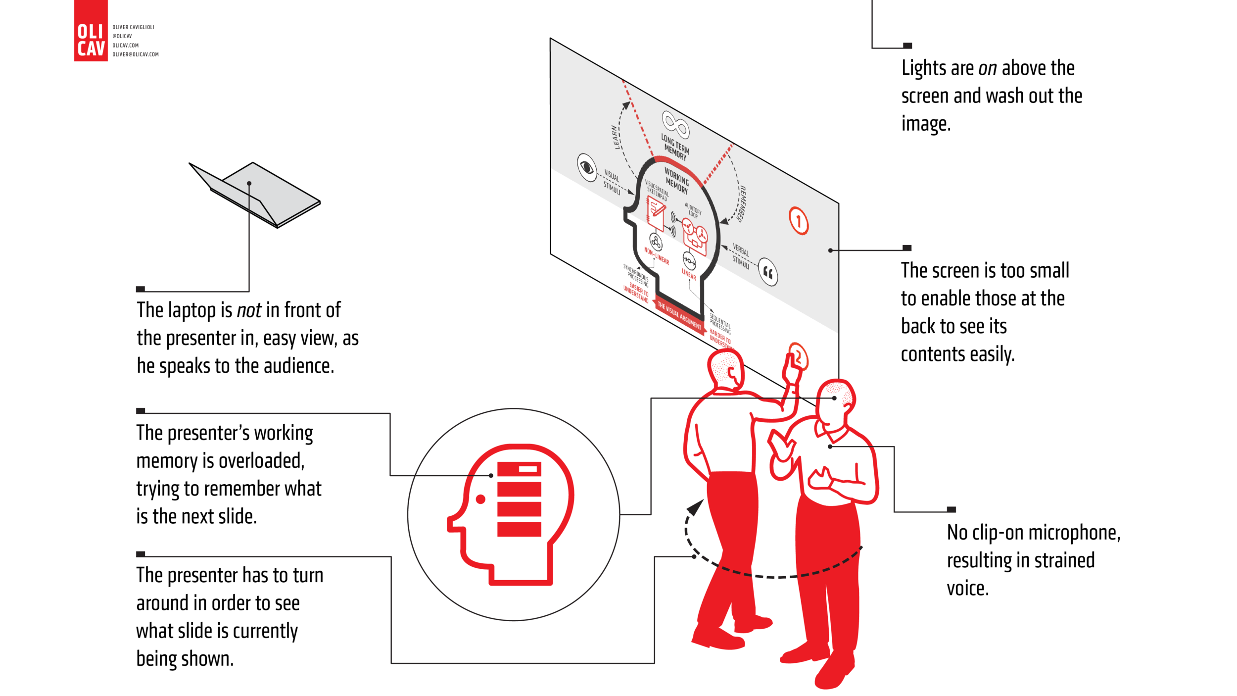
LAPTOP | With the laptop not in view of the presenter, he has to turn around and look at the screen in order to know which of his, sometimes 200+, slides is being projected. This is highly unsatisfactory to both presenter and audience. Equally — and insufficiently acknowledged — the presenter’s working memory is overloaded in the attempt to remember what his next slide will be. With over 200 slides, and involving many changes across different training events, this represents a serious challenge to the effectiveness of the presentation.

SCREEN | If the screen is too small for everybody on the back row to see its contents easily, without any strain, the whole presentation, or training day, is spoilt for many teachers. TV screens for classrooms are, quite clearly, far too small for training or presentation venues. Even within a classroom, for smaller events, the TV screen is often placed too low, resulting in the back row or two, having their view obscured by those in front.

MICROPHONE | No microphone for the trainer is a problem in larger venues. Hushed tones and subtle changed in tone are not possible at high volume. Even hand-held microphones are troublesome in restricting the presenter’s gestures.

Reversing these poor conditions, we can see what a venue that works well for its intended purpose looks like.

Presenting perfect conditions-01.png

SCREEN | This is the ideal size — almost cinema-like dimensions. This needn’t cost any more money as an actual screen is not necessary. A blank white wall will do nicely. All that’s required is for the projector to be moved back away from this wall. Or the use of a modern projector with a wide ‘throw’.

LIGHTS | Being able to switch off the light, or row of lights, nearest the screen, allows it to be strongly and sharply illuminated, while leaving the audience in light necessary for their note-taking and other activities.

CLIP-ON MICROPHONE | Small and unobtrusive, the clip-on microphone helps the presenter forgot it’s there. Now, different tones and subtleties of voice and breath can be used, decreasing the sense of space between trainer and audience.

LAPTOP | Oh what a difference having a laptop easily in view, in front of the presenter makes to the ease and effectiveness of his presentation. The current slide, projected behind him, is immediately visible on the small laptop screen. No inelegant and unprofessional turning around is necessary. And, equally, significant, the next slide is also on view, eliminating the devotion of valuable and scare working memory resources to trying to remember what comes next.

CLOCK | Not present in the image above, a large clock on the back wall, behind the audience and directly in the sight of the trainer, makes time-keeping a cinch.

The Elements of Modern Architecture

This is the first in a series of posts about books from my library that influence my aesthetics and ideas about graphic communication.

Starting off is this beauty. I bought it after I had completed half my Dual Coding book but realise it looks as if it strongly influenced its design. I have chosen this book, not because it is about architecture but because the way the book is designed, and how the precisely organised text is complemented by the hand-drawn sketches. You get an immediate sense of both by the cover. The title sits integrated within the sketch, and has a clear typographic hierarchy. By using two weights (the different thicknesses of the letters), a hierarchy is established without having to resort to different sizes. You also sense the aesthetics of this type of sketching. The lines are bold and, yet, have a ‘wobbliness’ that emphasises their direct human, non-digital execution.

Cover.png

Below is the contents page. Now, this I did directly use to design the reference pages of the Dual Coding book. Its precision and clarity made an immediate impact on me. And, as I had long wanted to rethink and redesign how academic references were presented, the idea of adapting this soon followed my initial viewing.

Contents.png

And, below, is a first mock-up of the Dual Coding references, that was later expertly applied by John Catt publishers.

Dual-Coding-references.png

Now comes a couple of pages from the book itself. You will see how a design grid doesn’t enforce a never-changing conformity. Both pages are different and — here’s the important message — the same. The commonality of the layout makes reading easier. There is no effort in orienting oneself to a new arrangement each time you face a new double-page spread.

1.png

Notice the bolder type for the heading. Nothing more fancy is needed. In terms of sketching for information, see how a simple line drawing is all that is needed. The red identifies the component under focus. With a clear, simple line drawing such pointers stand out immediately. There is no conflicting or competing visual feature.

2.png

I’m finishing off with this page of several sketches to encourage teachers who are convinced they can’t draw to stop telling themselves this inaccurate internal narrative. Study the images and note how simple the lines are. They are not drawn with a ruler and, so, have that endearing human variance, wobbling as they go along. Typographically, note how the red type — same size and weight as the body text — successfully draws your attention to highlighted facets.

Q&A PODCAST WITH THE STAFFROOM

Today, I was interviewed by Daniel Budd from The Staffroom. Here are his questions and a summary of my answers.

  1. Can you give our listeners some background and info about yourself?

    I’ve spent nearly all of my teaching career in special schools and during that period had close contact with educational psychologists. As a result, I developed a behavioural framework that I never entirely dropped when it became (perhaps rightfully) strongly devalued.

    The well-established focus on visual communication in special schools helped propel me to extend this approach to mainstream professional learning. My father’s architecture profession has been a strong influence as I emphasised a more structural and iconic style than current practitioners of sketch noting.

  2. Can you tell us why you think your visuals are becoming so popular with educators around the globe?

    Being free certainly helps their popularity! From the point of view of their content, I’d say that the predominance of words has helped. They are, for the most part, verbal summaries illustrated with a few drawings or icons. This helps teachers get a rapid understanding of a topic, in an easy-to-read format, with references to follow up should they want to.

    In terms of style, I spend a great deal of time thinking about the organisation of the material. This involves creating a hierarchy of information and positioning it so it aligns to a regular pattern making reading easier. Alongside this, I use a restricted colour palette and remember to safeguard white (ie unused) space.

  3. Do you think all teachers should know about cognitive psychology?

    Yes! It teaches us about our biological limits (ie working memory) and tells us what strategies work best at addressing this (retrieval practice, spaced practice, elaboration and so on).

    Because cognitive psychology research is conducted in laboratories, it used to be thought irrelevant to the rich, messy world of classrooms. However, the precise replication of studies over several decades (some for a century) point us to very well established truths about how we process and think about information that cannot be ignored.

  4. Can you explain why you think sketch noting is an effective method of learning?

    I’d like to distinguish between a teacher using sketch noting in order to support their explanation, and students using it for learning.

    Teachers benefit in the same way they do when constructing knowledge organisers — it makes them identify the key pieces of knowledge. Sketchnoting has the additional possibility of identifying the connections between these, sometimes isolated, facts.

    For students it’s different. They are novices and, as such, do not have the knowledge base in order to make such judgements. However, when supported by teachers’ structures and explanations, and when they are further along the expertise continuum (towards the end of a module or topic), this approach can pay dividends.

    In both contexts, the main part that makes the biggest impact on learning is the summarisation of text. It’s nothing new— just a current branding of the old précis many of us did while students.

    The visual aspect can be very useful when the sketches are explanatory in nature and not merely decorative. It’s important, therefore, for teachers to be keenly aware of this difference and to prevent students avoiding the hard work of summarising for the more enjoyable task of doodling and colouring.

  5. Can you give teachers some practical tips on how to create effective visuals that support learning?

    Concentrate first on the words and create a hierarchy with the most important concepts being clearly signalled by size, colour or shape of letters. Order your work on the paper/screen so the elements align and remember to leave sufficient space around them that they are able to ‘breathe’. If everything stands out then nothing stands out. This applies too to colour. Practice restraint and your colour/s will create more powerful signals to what you have identified as being important.

    As to drawing, remember we are talking about communication, not art. So use simple lines and shapes. Try viewing Dave Gray’s wonderful introductions on YouTube. Don’t use images from Google. Instead, find a way of tracing them as simple lines with backgrounds cut out, as line drawings are shown to be fare more instructive than photographs or highly coloured drawings. Make it all simple, not complicated.

  6. If you could recommend one professional reading book to a new teacher, what would it be and why?

    I recommend Daisy Christodoulou’s Seven Myths About Education. New teachers are likely to be told a variety of things about how to teach that are not effective but are very time-consuming. Daisy’s book will tell new teachers what is misguided advice and what to be wary of. In the light of the problem in the UK of teacher retention — especially of new teachers — knowing what not to waste your time on is priceless.

The-Staffroom-Podcast-logo.png

WORKING WITH THE LEARNING SCIENTISTS

"What do you think of this? Did I get that bit right? What if I reduced it down further by…? Are the main points sufficiently clear? These are the sorts of questions I kept asking the Learning Scientists (aka Dr Megan Sumeracki and Dr Yana Weinstein ) while I was illustrating their writing of the book  Understanding How We Learn (Routledge). 

We've been collaborating for a couple of years now so they were used to my constant need to confirm my own understanding. Our previous work in creating posters and PowerPoint slides on their selected top six learning strategies had established a relaxed working relationship. As I could ask as many questions as I wanted until I understood, it meant I was privileged to receive what amounts to personalised seminars by two of our leading cognitive scientists.

I'd long realised that while one can bluff one's way with elaborate and elegant prose, drawing provided no such camouflage for not understanding. Cognitive scientists Logan Fiorella and Richard E. Mayer in their 2015 book Learning As A Generative Activity (Cambridge) provide interesting commentaries on a number of research studies that demonstrate this phenomenon in the classroom. I had learned it was the same outside the classroom too.

This was especially true when I tried to capture visually what exactly happened in some of the selected studies. I admit to being pretty naive when it comes to research design but reckoned I ought to be able to clarify the behavioural components of the subjects under scrutiny — who does what, under which conditions, for how long, and so on. When I showed Megan a number of early versions it was immediately apparent to her what I had misunderstood. Tweak by tweak, we arrived at an image that was true to the descriptions of the study.

Through the technology of Skype, email and a productivity app, we were able to work in this way across continents. But only through a trusting working relationship could we work so effectively across the terrain of developing understanding — which is pretty apt given the title of the book.  

In further posts on the book, I'll explain how

• editorial design (how newspapers and magazines are planned) influenced the format of the book and supported easier navigation for the reader

• I managed to create 90+ icons, all related in different ways to cognitive psychology

• the visual summaries of research studies were arrived at and eventually looked.

Yana-&-Megan-blue-smaller.png

DIRECT INSTRUCTION summary

I have started a series of posters on Direct Instruction (DI)  in collaboration with maths teacher, Ben Gordon (@mathsmrgordon). We were keen to help promote and clarify the benefits of this approach to teaching. 

The posters are free to download from this site and are about a range of different aspects of DI.

My first encounter with DI was with the SRA reading programme in the early 1980s while teaching in a special school. Later, while the very fortunate beneficiary of a whole year's full-time secondment to the Cambridge Institute of Education, I learned more about DI through the Project Follow Through. 

Strangely, the conclusion we students were given about Project Follow Through was that progressive, constructivist early years programme, HighScope, was the 'winner' of the contest to find the most effective method of teaching. Maybe that conclusion was the inevitable cognitive bias of a UK generation seemingly addicted to romantic progressive notions of child development and learning in general.

DI-Clear-Teaching-poster-2.png